
Packaging
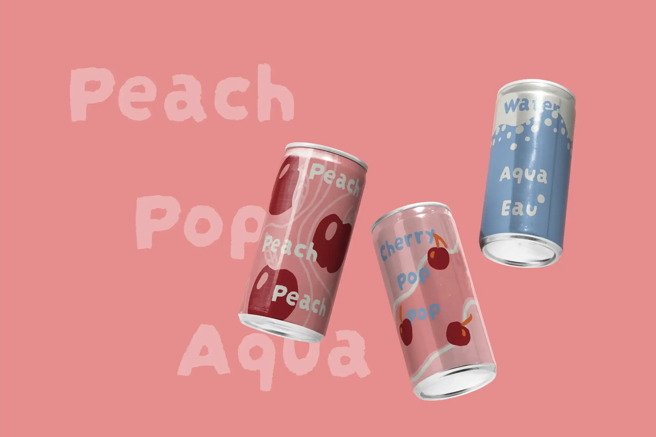
Peach! Pop! Aqua!
Beverage packaging concept
illustration, brand identity
The challenge
Beverage shelves are loud. Sparkling water and fruit soda packaging tends to lean on the same playbook: glossy gradients, photoreal fruit, condensation droplets doing the emotional labor. We wanted to test what happens when a can looks hand-drawn instead of hand-rendered, something that feels like a person made it.
The approach
Each flavor is built from a small set of loose, confident shapes. A peach reduced to two warm curves and a highlight. A cherry is a dot and a stem. Flavor names repeat across the can at different scales, almost like a chant, giving the label rhythm.
Color carries the shelf logic. Peach lives in a peachy pink, Cherry Pops in cherry red, Water in a cool, clean blue, so the range reads from a distance, even before the illustration registers.
The water can does double duty: "Water / Aqua / Eau" is folded into a single hand-painted splash, covering three markets with one design and no separate translation layout. A small decision, but the kind that matters once a client is thinking about production.
The outcome
A cohesive three-flavor system that feels illustrated rather than manufactured, distinct enough to stand apart flavor to flavor, unified enough to read as one brand. Built to hold up equally well in a static shelf shot and a dynamic, tumbling hero image.